Help
How Tonera works
Tonera gets artwork ready for DTF printing. You bring a design, usually sitting on a white or black background, and you leave with a clean transparent PNG at the right print size. Everything happens in your browser; your files are never uploaded.
Most designs only need four steps:
- Open your artwork, or drag it onto the editor.
- Remove white or Remove black in Knockout.
- Check it on a garment color and let the print check fix any soft pixels.
- Export at your print size.
The editor has your tools on the left, the preview in the middle, and the output panels on the right. Click a panel’s title to open or close it. Every setting below can be undone, so feel free to experiment.
- Transparent
- Areas with no ink at all. The shirt shows through.
- Soft pixels
- Pixels that are partly see-through, found in smooth edges, shadows and glows. They print poorly on DTF film.
- PPI
- Pixels per inch. 300 is the usual target for sharp prints.
- DTF Safe
- Every pixel is either fully printed or fully clear. Nothing in between.
File & Canvas
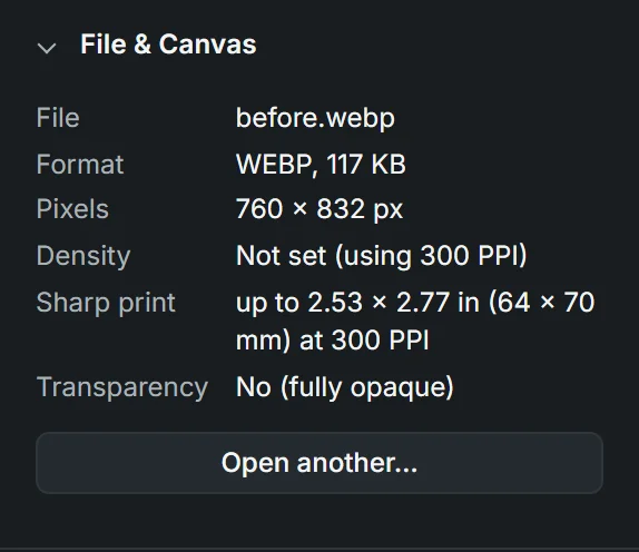
Open artwork with the Open button, by dragging a file anywhere onto the editor, or by pasting an image you copied. PNG, JPEG and WebP all work. This panel tells you what you’re working with.
- Pixels
- How many pixels wide and tall the artwork is. This is what decides how big it can print sharp.
- Density
- How many pixels go into each printed inch (PPI). Images from the web often say 72 PPI, which would make them print huge and blurry, so Tonera opens everything at 300 PPI, the number most print shops ask for.
- Sharp print
- The biggest size this file prints at without going soft. If you need it bigger, you need a bigger original.
- Transparency
- “No” means the file has a solid background everywhere, like most JPEGs. That’s what Knockout is for.
Knockout
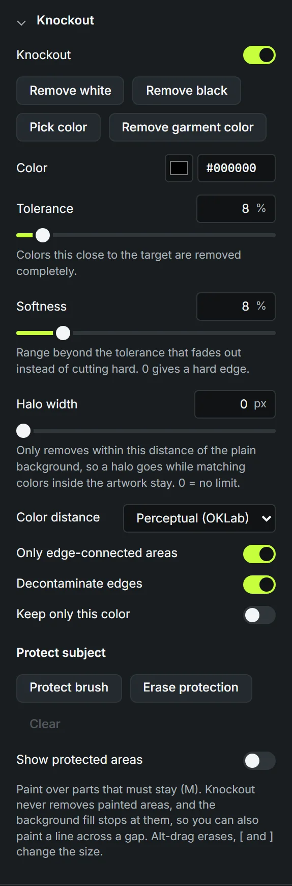
Knockout removes a background color so only your design ends up on the film. For most artwork, one click on Remove white or Remove black does the job. The rest of the settings are there for when it doesn’t.
- Knockout
- Turns the whole knockout on or off, so you can quickly see the artwork with and without it.
- Remove white / Remove black
- Sets the color to remove and turns knockout on. Start here.
- Pick color
- Turns the cursor into an eyedropper. Click the background in the preview to remove that exact color. Sample size picks one pixel or averages a small square, which helps on noisy JPEG backgrounds.
- Remove garment color
- Shows up when you preview on a shirt color. Removes that color from the design, so the shirt shows through instead of printing ink that matches it.
- Color
- The color being removed. Type a hex code if you know it.
- Tolerance
- How close a color has to be to count as background. Raise it if bits of the background are left behind. Lower it if parts of your design start to disappear. Small steps go a long way.
- Softness
- A fade zone just past the tolerance, where colors are partly removed instead of cut off. A little softness gives smoother edges; 0 gives a hard cut.
- Halo width
- Limits the removal to a thin band around the outside of the design. Great for getting rid of a white halo while keeping white inside the design, like eyes or highlights. 0 means no limit.
- Color distance
- How “closeness” between colors is measured. Leave it on Perceptual, which judges color the way your eyes do. The others are there if you’re used to them from other tools.
- Only edge-connected areas
- On: only removes background that touches the edge of the image, like a flood fill from the outside. Black inside letters or a dark shadow on the dog stays. Off: removes that color everywhere, including inside the design.
- Decontaminate edges
- Where an edge was blended with the old background, this takes that background color back out, so you don’t get a thin dark or white outline. Leave it on.
- Keep only this color
- Flips it around: keeps the chosen color and removes everything else. Handy for pulling a single-color logo or text out of a design.
Protect subject
Sometimes the color you’re removing also appears inside the design: white eyes on a design with a white background, or a black outline that touches the black background. The protect brush keeps those parts safe.
Press Protect brush (or M) and paint over anything that must stay. Knockout never removes painted areas. It also stops the background removal from leaking through, so you can paint a line across a gap to close it off.
- Erase protection
- Removes paint you didn’t mean to put down. You can also hold Alt while painting.
- Clear
- Removes all protection in one go.
- Show protected areas
- Tints painted areas so you can see what you’ve covered.
- Brush size
- How big the brush is. The [ and ] keys make it smaller and bigger while you paint.
Edge Cleanup
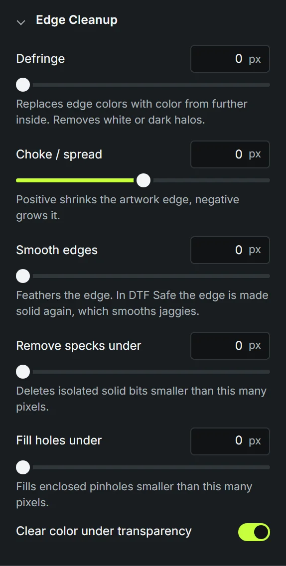
Once the background is gone, the edge of your design is where problems show up on the shirt. These settings tidy it up. They all start at 0, so nothing changes until you ask for it. Small numbers, 1 or 2 pixels, are usually enough.
- Defringe
- Replaces the outermost pixels of the edge with color from just inside the design. This gets rid of a leftover white or dark rim that knockout couldn’t catch.
- Choke / spread
- Positive numbers shrink the design’s outline slightly (choke), which hides a ragged rim. Negative numbers grow it (spread), which can rescue very thin lines.
- Smooth edges
- Smooths out jagged, stair-stepped edges. In DTF Safe the edge is made solid again afterwards, so you get a smoother outline without soft pixels.
- Remove specks under
- Deletes tiny loose bits of the design smaller than this many pixels. Leftover dust from a JPEG background is the usual suspect. Be careful with splatter or grunge designs, where small specks are part of the look.
- Fill holes under
- Fills tiny see-through pinholes inside the design that are smaller than this many pixels.
- Clear color under transparency
- Fully transparent pixels can still secretly carry a color. This wipes it, so nothing hidden can sneak into the print. Leave it on.
Print Check
DTF printers don’t handle “half see-through” well. A pixel that’s 40% transparent doesn’t print as a light version of the color. It tends to come out patchy, faint or not at all, and soft shadows and glows can look dirty after pressing. We call these soft pixels.
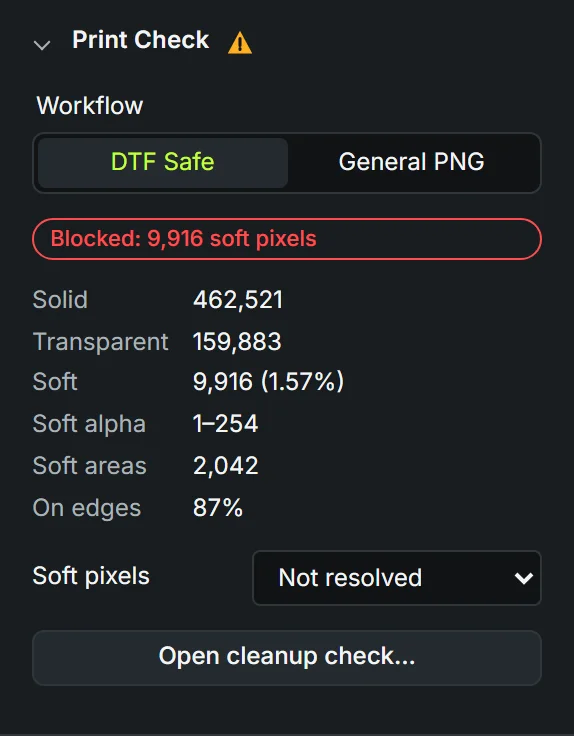
Print Check counts them and helps you decide what to do. A warning triangle on the panel means there’s something to look at.
- Workflow
- DTF Safe makes sure every pixel is either fully printed or fully clear before you can export. Use it for DTF film. General PNG allows soft pixels, for when the file is going somewhere else, like a mockup or a website.
- Solid, Transparent, Soft
- How many pixels are fully printed, fully clear, and in between. In DTF Safe, Soft needs to reach 0.
- Soft pixels
- How to fix them. Make solid turns soft pixels into solid ones or removes them, depending on how see-through they are. Best for edges. Remove soft pixels deletes them all. Best for faint haze.
- Solid threshold
- Shown with Make solid. Soft pixels more solid than this become fully solid; the rest are removed. Lower it to keep more of a soft edge, raise it for a tighter edge.
- Open cleanup check
- Opens the cleanup check, which explains what it found and can fix it with one click. It also opens on its own if you try to export a file that isn’t DTF Safe yet.
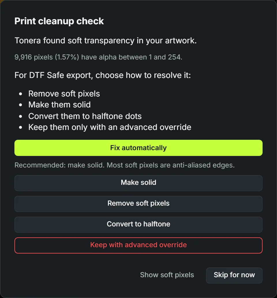
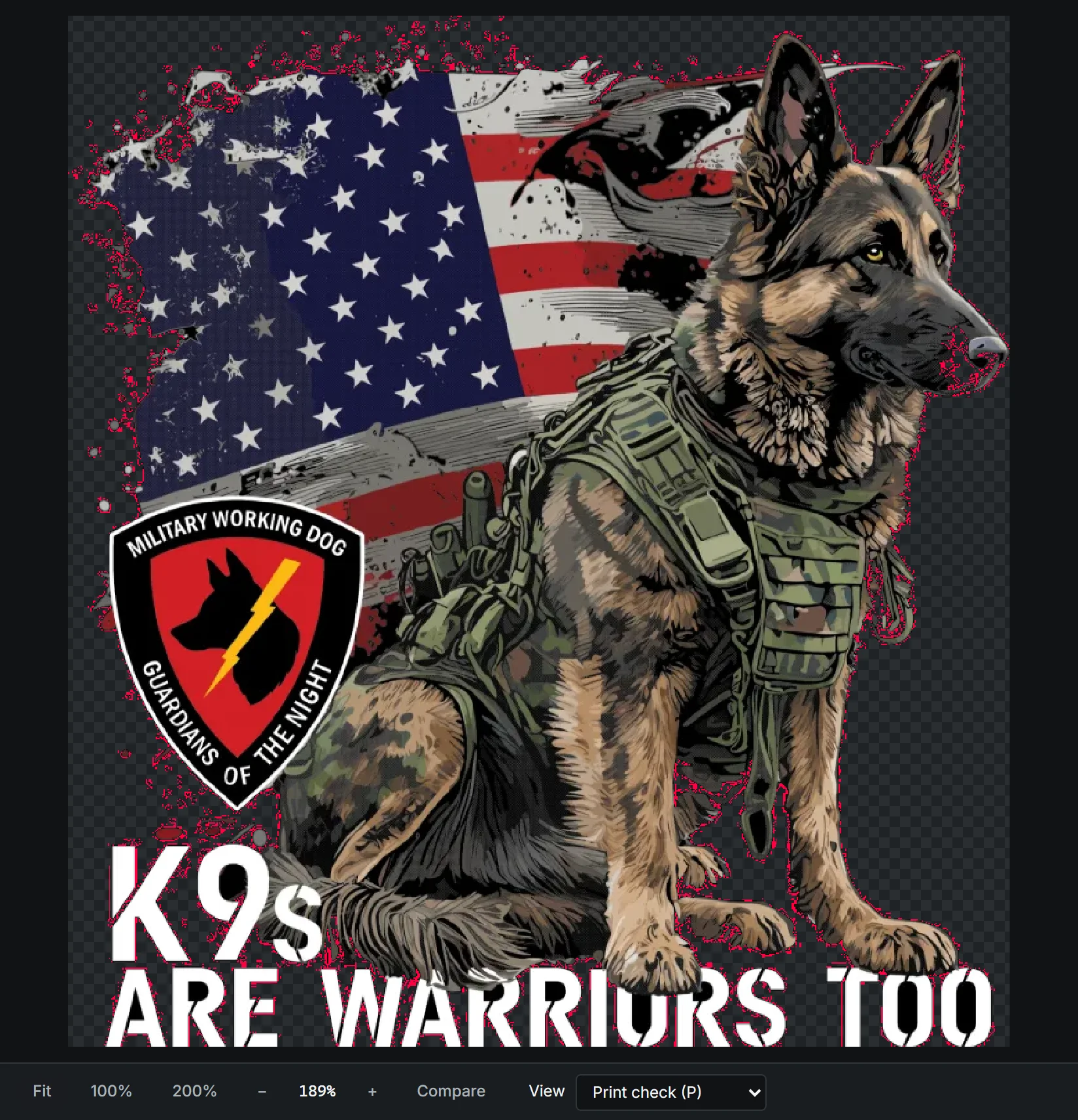
Keep with advanced override exports the soft pixels anyway. Only use it if your print shop has told you their setup handles them. The file and project are marked Non-DTF-Safe Override so nobody gets surprised later.
Halftone
Halftone turns soft fades, shadows and glows into a pattern of solid dots, the way screen printers have always done it. From a normal viewing distance it still looks like a fade, but every dot is fully solid, so it prints clean.
Not sure where to start? Pick a Preset, then adjust. Presets keep your Smallest dot setting, because that one belongs to your printer.
- Mode
- Off: no dots; Print Check handles soft pixels. Smart: solid areas stay solid, only fades, shadows and glows become dots. This is the one you’ll want most often. Full design: the whole design is turned into dots by tone, for a vintage or screen-printed look.
- Line screen (LPI)
- How many rows of dots fit in an inch. Lower numbers mean bigger, more visible dots that hold up better on film. Higher numbers mean finer dots and more detail, but they need a printer that can hold them. The presets use 20 to 40.
- Angle
- The angle of the dot rows. Straight rows (0° or 90°) tend to clash with the pixel grid and fabric weave and create wavy patterns (moiré). 22.5° or 45° avoid that.
- Dot shape
- Round is the classic choice. Ellipse gives smoother mid-tones, Line gives a lined, engraved look; the others are mostly for style.
- Dot color
- Original: each dot keeps the colors of the artwork underneath it. Flat per dot: each dot is one solid color, for a cleaner, more graphic look.
- Smallest dot
- Dots and gaps smaller than this are dropped or enlarged, so nothing is too small to survive printing, powdering and pressing. Ask your print shop what their setup holds; 2 px at 300 PPI (about 0.17 mm) is a careful start.
- Gamma
- Shifts the middle tones. Above 1 makes mid-tones lighter (smaller dots), below 1 makes them darker (bigger dots).
- Contrast
- Pushes light tones lighter and dark tones darker, so the dots get more punch.
- Dot gain
- Ink spreads a little when it prints, so dots come out bigger than on screen. If your test prints look too dark or filled in, use a negative value to make dots slightly smaller.
- Dark garment
- Full design only. Flips the logic for dark shirts: light areas become dots and dark areas are left open so the shirt shows through, instead of printing black ink on a black shirt.
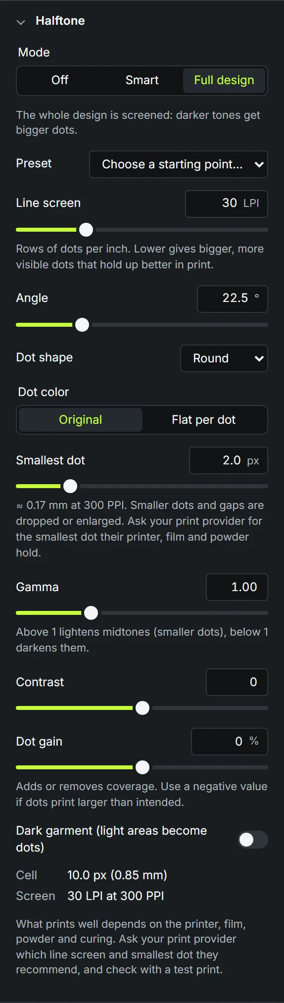
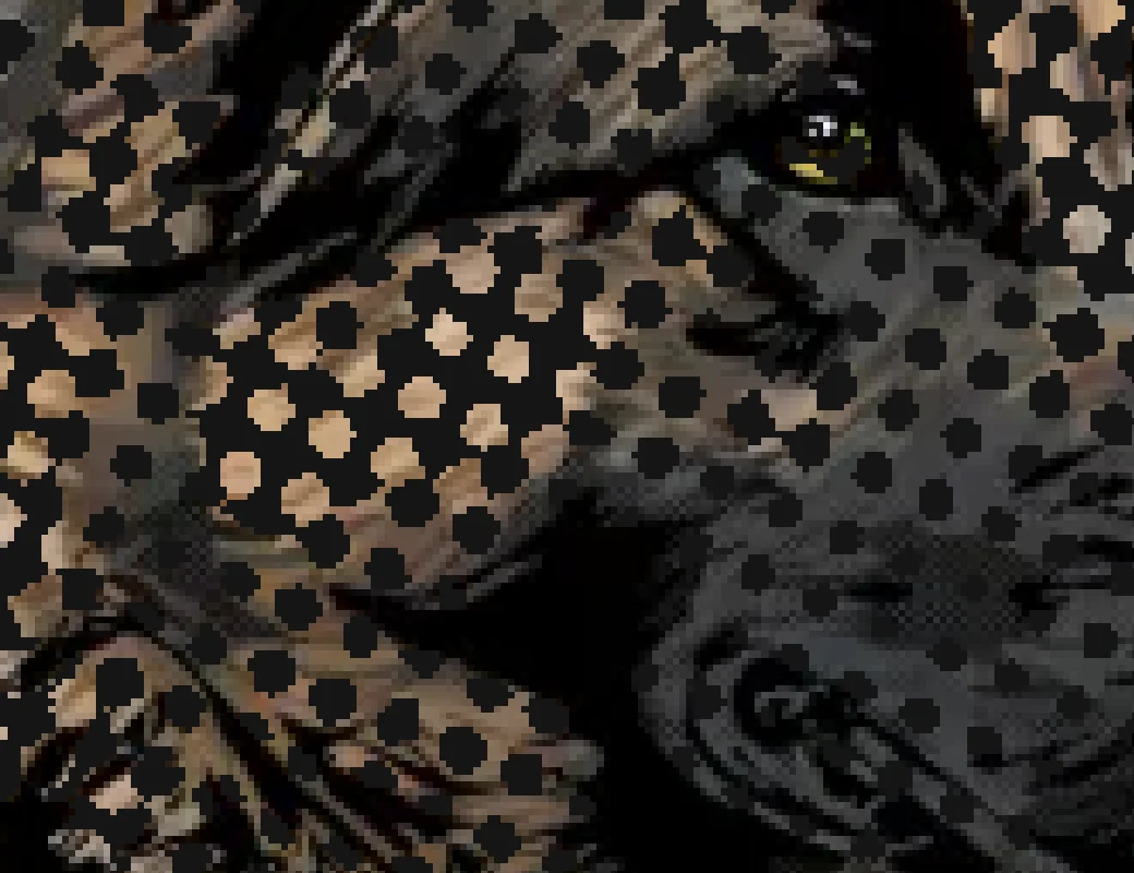
What prints well depends on the printer, film, powder and curing. Do a test print before a big run, and ask your print shop which line screen and smallest dot they recommend.
Garment Preview
Shows your design on a shirt color, so you can spot halos and leftover background before they end up on fabric. The checkerboard shows plain transparency. Pick the rainbow swatch for any other color.
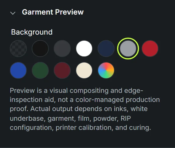
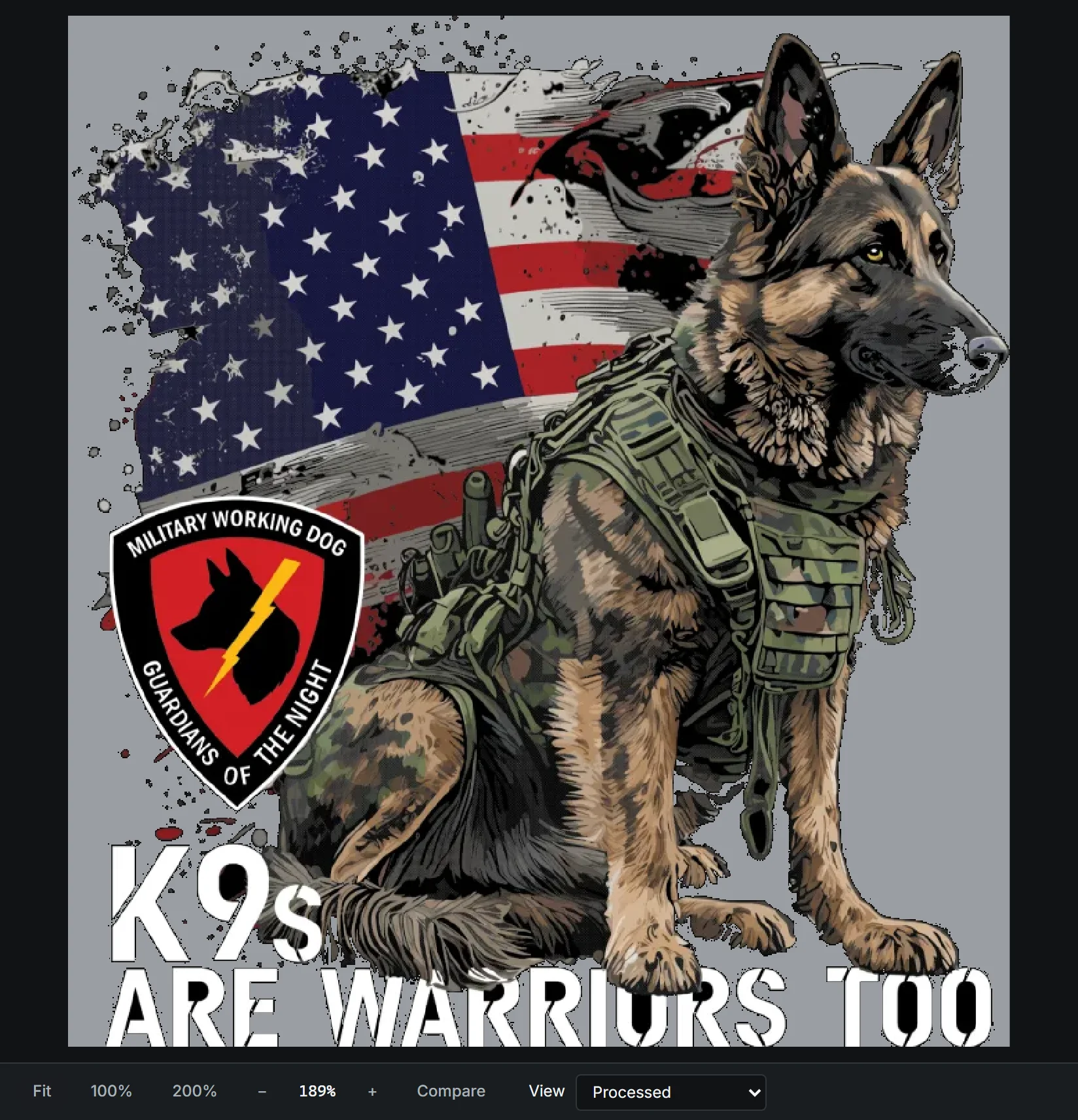
The preview is a visual check, not a color proof. Real colors depend on the inks, the white underbase, the fabric and how the printer is set up.
Export
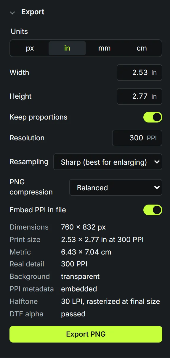
Sets the final print size and saves the PNG you send to the printer. The file is always a transparent PNG unless you choose a background.
- Units
- Work in pixels, inches, millimeters or centimeters. Pick whatever your print shop uses.
- Width / Height
- The size of the print. With Keep proportions on, changing one changes the other so the design doesn’t stretch.
- Resolution (PPI)
- Pixels per inch in the final file. 300 is the standard for DTF. If you’re working in inches or centimeters, changing this keeps the print size and changes the pixel count.
- Resampling
- How new pixels are made when you change the size. Sharp is the best choice for most artwork, especially when enlarging. Smooth is softer and gentler on photos. Nearest keeps hard square pixels, for pixel art.
- Reset to source size
- Appears when you’ve changed the size. Goes back to the artwork’s own pixel size.
- PNG compression
- Only changes the file size and how long saving takes. The image is exactly the same either way.
- Embed PPI in file
- Writes the resolution into the PNG, so the printer software opens it at the right physical size. Leave it on.
- Solid background
- General PNG only. Fills the transparent areas with a color, for mockups or previews. Never use it for DTF film.
- Real detail
- How much actual detail ends up in each inch. Enlarging adds pixels but not detail, so if this drops below 300 PPI you’ll get a warning: expect a softer print.
Free accounts see one short ad before the first export of each session. Pro removes it. The Export button is greyed out while the file still has soft pixels in DTF Safe; fix them in Print Check first.
Diagnostics
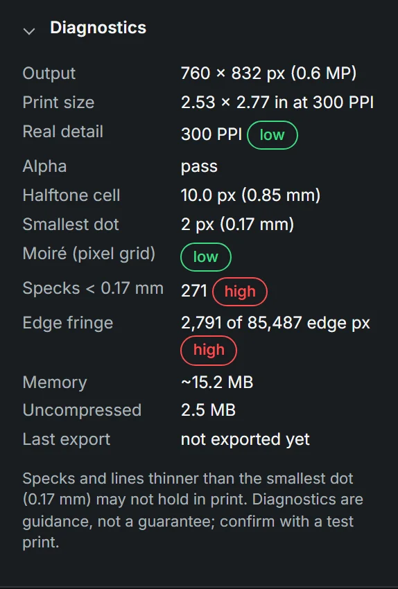
A last look for things that might cause trouble in print. It never blocks anything; it’s a second pair of eyes. Green is fine, yellow is worth a look, red needs attention.
- Real detail
- The same detail check as in Export. Red means the print will look soft or blocky.
- Alpha
- Whether the file passes the print check.
- Halftone cell, Smallest dot
- The size of one dot cell and the smallest dot, in pixels and millimeters, so you can compare with what your print shop says.
- Moiré
- The risk of a wavy interference pattern between the dots and the pixel grid. Changing the line screen or angle usually fixes it.
- Specks / Lines
- Bits and lines thinner than your smallest dot. They may not survive printing and pressing. Make them thicker, or clean them up in Edge Cleanup.
- Edge fringe
- How much of the edge still carries the old background color. If this is high, try Defringe or Decontaminate edges.
- Memory, Uncompressed, Last export
- How heavy the file is. Very large prints can make the browser slow.
History & projects
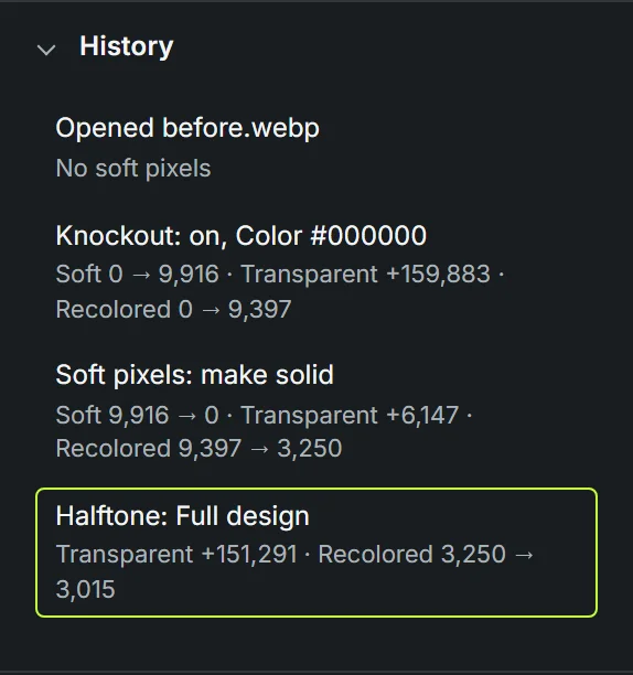
Every change you make is a step in History, with a note about what it did, like how many pixels were removed. Click any step to jump back to it. Undo and Redo do the same one step at a time, and Reset puts every setting back to the start.
Save downloads a small project file with all your settings. Open it later together with the same artwork to pick up where you left off. The artwork itself isn’t inside the project, so keep the original file too. You can also apply a project to a different artwork to reuse the same recipe.
Views & shortcuts
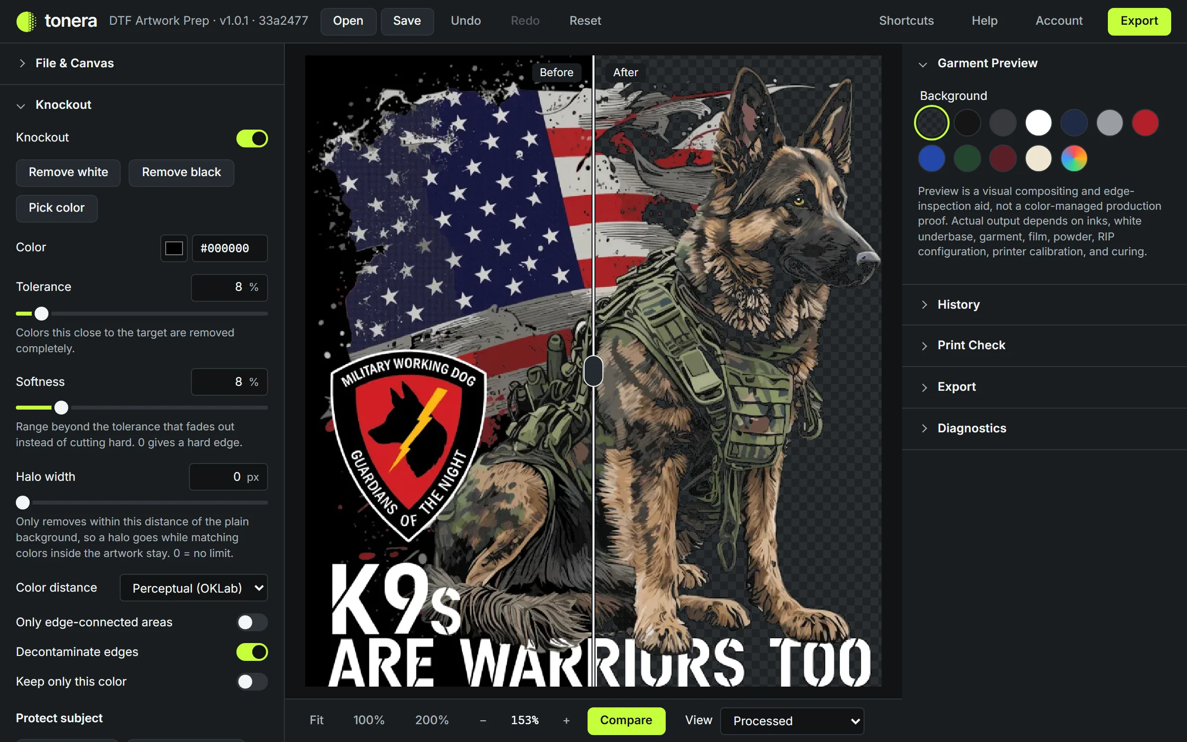
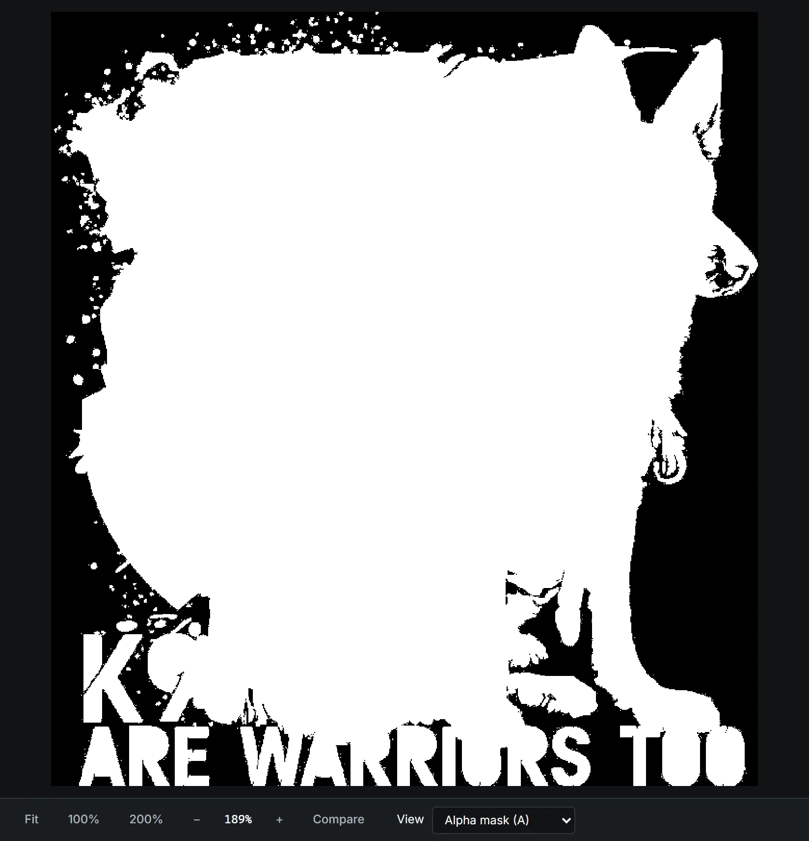
The View menu under the preview shows your artwork in different ways. They don’t change the file, they just help you see what’s going on. Hover over the preview to read the exact color of any pixel.
- Processed
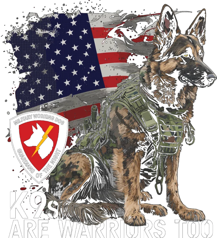
- The result, as it will be exported.
- Original B
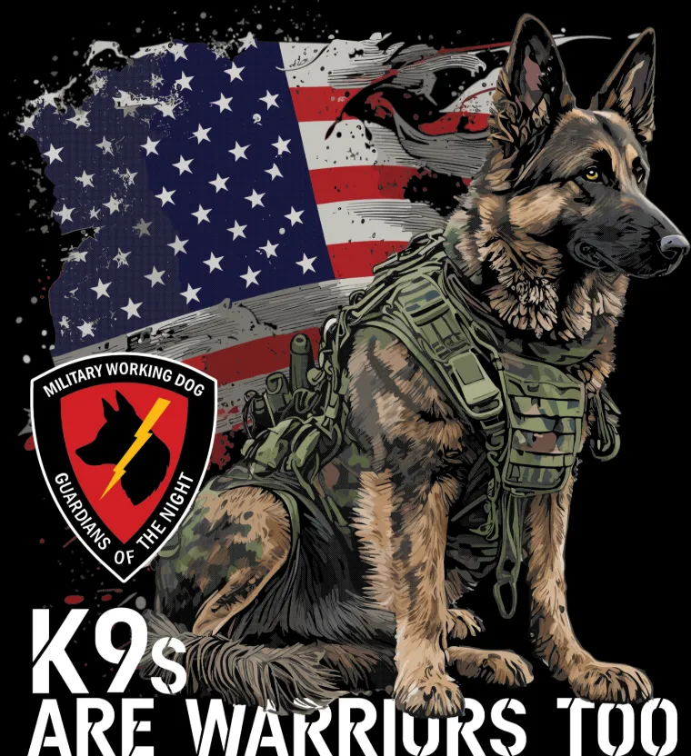
- The artwork as you opened it.
- Compare C
- Before and after side by side. Drag the divider.
- Alpha mask A
- White prints, black is clear, gray is soft.
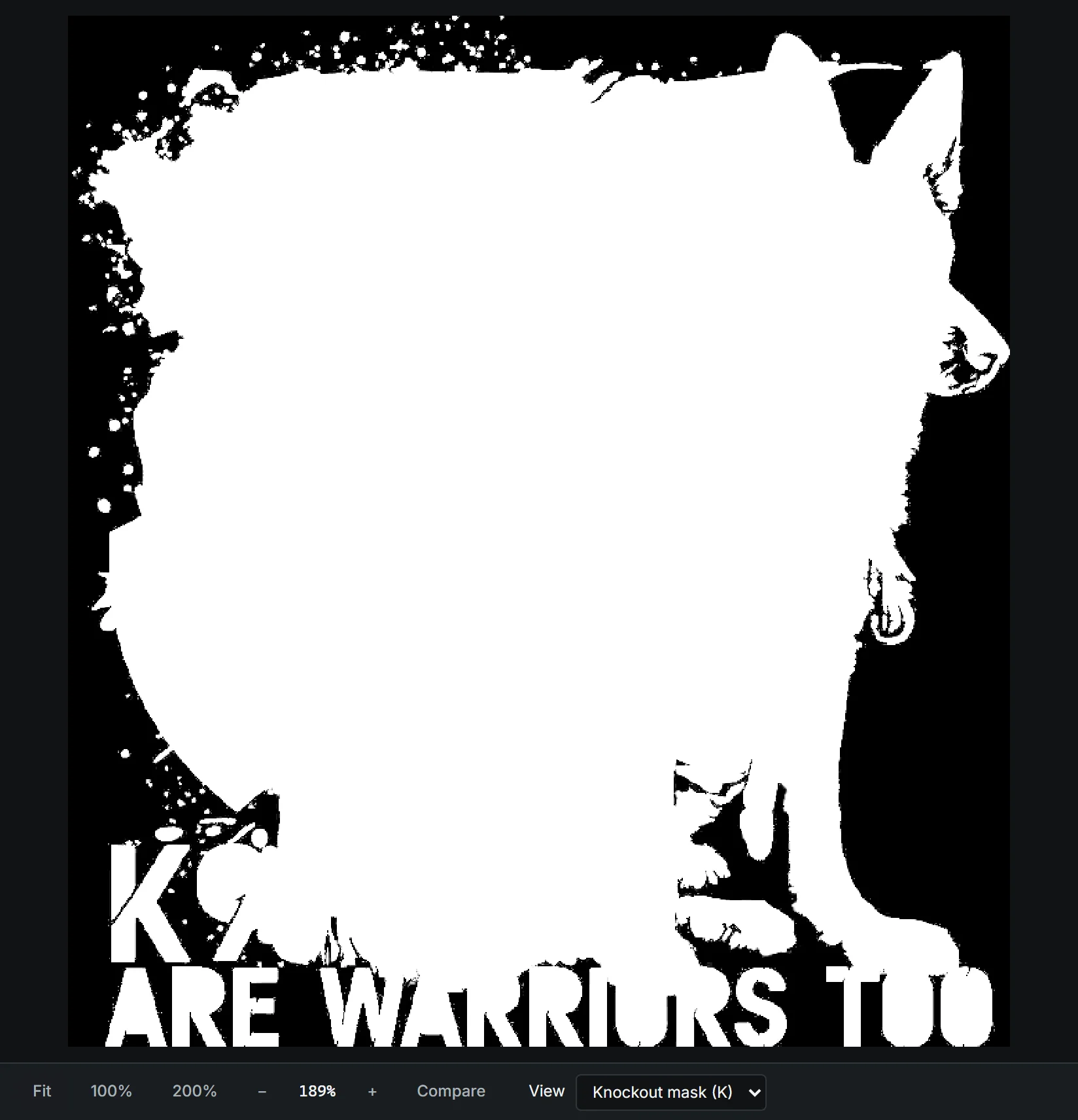
- Knockout mask K
- What knockout keeps (white) and removes (black).
- Soft pixels only
- Soft pixels light up, everything else is dimmed.
- Print check P
- Soft pixels in bright red on top of the result.
- Halftone grid G
- Draws the dot cells, to check line screen and angle.
Zoom with the mouse wheel, 1 for 100% or F to fit. Hold Space and drag to move around. Press ? in the editor for the full list of shortcuts.
Common problems
There’s a white (or dark) line around my design.
Make sure Decontaminate edges is on. Then try Halo width at 2–4 px with a slightly higher Tolerance, or Defringe at 1 px in Edge Cleanup. Check the result on a garment color.
Parts of my design disappeared.
The design contains the color you’re removing. Lower the Tolerance, turn on Only edge-connected areas, or paint over those parts with the Protect brush.
Some background is left inside letters or between shapes.
Those areas don’t touch the edge, so they’re kept while Only edge-connected areas is on. Turn it off, or click inside them with Pick color.
I can’t click Export.
In DTF Safe the file still has soft pixels. Open Print Check and choose a fix, or press Fix automatically in the cleanup check.
My shadow or glow vanished after the print check.
Make solid gives soft areas a hard edge. To keep the fade, turn on Halftone in Smart mode instead.
The print came out blurry.
The artwork was probably printed bigger than its pixels allow. Check Sharp print in File & Canvas and Real detail in Export. A bigger original is the only real fix.